Chapter 2 Interactive Maps
Interactive maps have become commonplace in the web’s tools for communicating geographic information. While they are user friendly representations, building even the simplest of maps requires some basic knowledge of how the data are structured. For example, the map below plots the per capita personal income growth for 2016.
Figure 2.1: What will be built in this session
In order to render the color-coded polygons as a chloropleth map, we need two types of information: the geometries of US states and their economic attributes. The shape of each state is stored in a special data format, such as a shapefile or GeoJSON, that contains geographic coordinates and properties that indicate the type of shape (e.g. line, polygon, point). The geometries on their own are useful to render the outline of each state, but do not usually come furnished with economic data. Each shape is associated with an identifier that can be used to join new data, such as economic attributes.
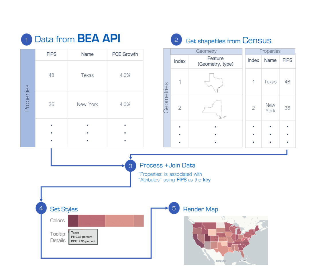
Figure 2.2: Process flow for creating map.
Below, in order to construct a map containing growth of per capita personal income and personal expenditures by state, we layout and illustrate a five step process:
- Get BEA data from the API and make adjustments
- Get US state shapefile from the US Census Bureau
- Join the data
- Set visual styles and functionality
- Render map
2.1 Get BEA data
Using the R library’s beaGet() function, we will make two requests via the BEA API:
- Annual Per Capita Personal Income by State as available in table CA1
- Annual Per Capita Personal Expenditure by State as available in table C3
In order to calculate growth, we will request two years of data: 2015 and 2016. In the code below, notice that the request parameters are first inserted in a list() object, then passed to the beaGet() function. The result is a data.table containing time series data.
library(bea.R)

beaKey =  "36-character key goes here"

#Personal Income Per Capita
  #Specify request parameters
  pcinc_req <- list(UserID   = beaKey,
                    Method   = 'getdata',
                    LineCode   = '1',
                    TableName  = 'CA1',
                    Frequencu  = 'a',
                    DatasetName = 'regionalincome',
                    Year     = '2015,2016',
                    GeoFIPS   = 'state')

  #Send parameters via beaGet
  pcinc_regional <- beaGet(pcinc_req)

# Personal Consumption (IndustryID = 1 indicates all)
  #Specify request parameters
  pcpce_req <- list(UserID = beaKey,
                    Method = 'GetData',
                    DatasetName = 'RegionalProduct',
                    Component = 'PCPCE_SAN',
                    IndustryID = '1' ,
                    Year = '2015,2016',
                    GeoFIPS = 'state',
                    Frequency = 'a')

  #Send parameters via beaGet
  pcpce <- beaGet(pcpce_req)
2.2 Get shapefile
Next, a geometry file is required. The US Census Bureau publishes shapefiles for select geographic areas, including US states. Boundary files can be downloaded from https://www.census.gov/geo/maps-data/data/tiger-cart-boundary.html.
BEA has developed a simple function to download, unzip, and load Census shapefiles. This function requires the rgdal package to load shapefiles.
library(rgdal)
getShape <- function(url){
  #
  # Download, unzip and load shapefile from URL
  #
  # Args:
  #   url = URL to zip file containing shapefile
  #
  # Returns:
  #
  #   Loaded shapefile

  #Create temp objects
  temp_dir <- tempdir()
  temp_file <- tempfile()

  #Download and unzip file
  download.file(url, temp_file,method="libcurl")
  unzip(temp_file, exdir = temp_dir)

  #Load shapefile
  file_prefix <- grep("*\\.shp$",list.files(temp_dir), value = TRUE)
  file_prefix <- gsub("\\.shp", "", file_prefix)
  return(readOGR(temp_dir, layer = file_prefix, verbose = FALSE))
}
Upon loading the function, we now can import a US state shapefile direct from the Census website.
url <- "http://www2.census.gov/geo/tiger/GENZ2016/shp/cb_2016_us_state_20m.zip"
states <- getShape(url)
In its most basic form, the shapefile yields a map of state outlines.
plot(states)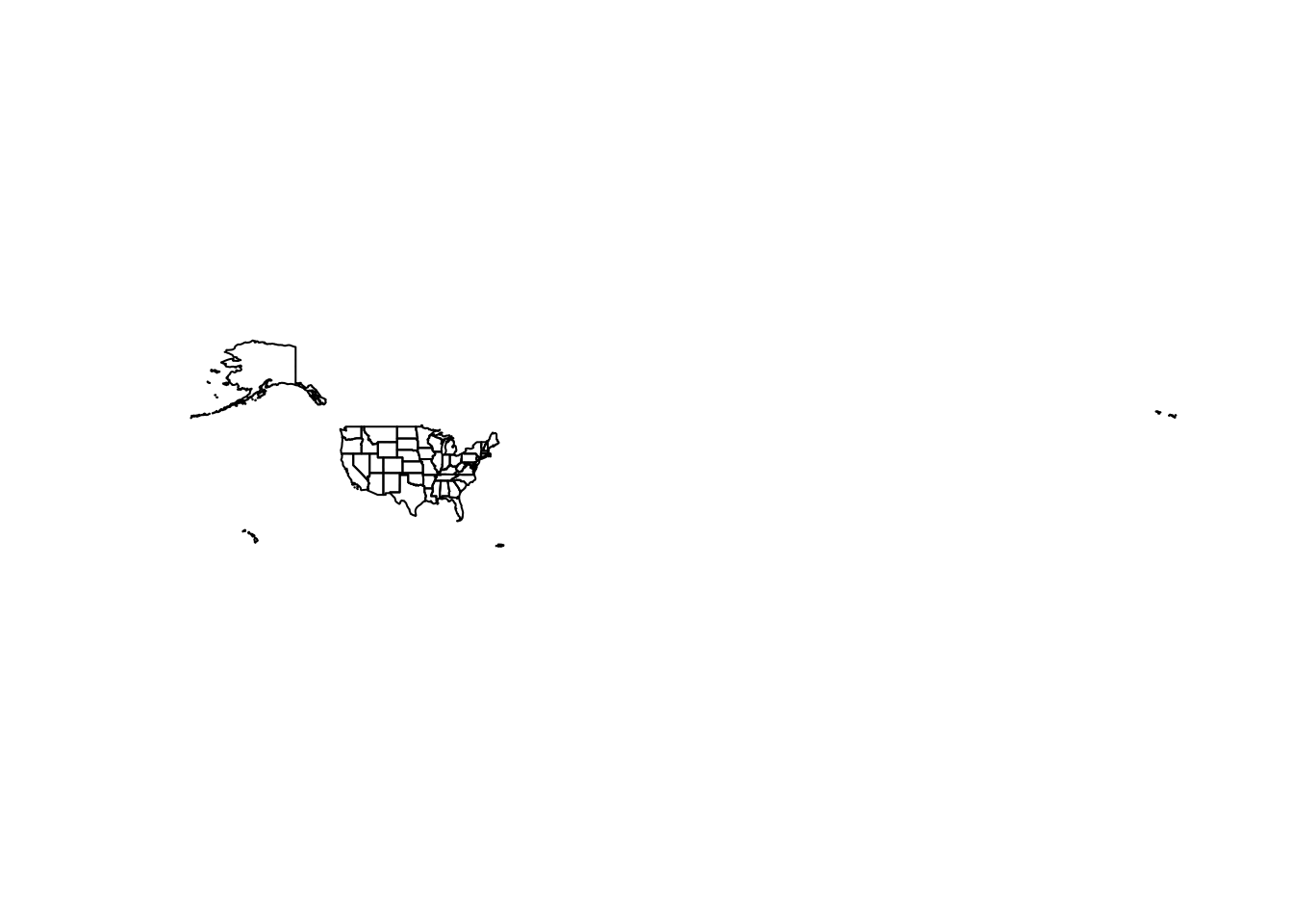
2.3 Process and join data
With the shapefile and indicators loaded, we can inspect the layout using the head() function. From the geometry side (e.g. states), the STATEFP field is a Federal Information Processing (FIPS) code, a hierarchical classification system to uniquely identify geographic units. This field will be used to match between the shapefile and each of the indicator files.
##   STATEFP  STATENS    AFFGEOID GEOID STUSPS     NAME LSAD        ALAND
## 0      23 01779787 0400000US23    23     ME    Maine   00  79885221885
## 1      15 01779782 0400000US15    15     HI   Hawaii   00  16634100855
## 2      04 01779777 0400000US04    04     AZ  Arizona   00 294198560125
## 3      05 00068085 0400000US05    05     AR Arkansas   00 134771517596
## 4      10 01779781 0400000US10    10     DE Delaware   00   5047194742
##        AWATER
## 0 11748755195
## 1 11777698394
## 2  1027346486
## 3  2960191698
## 4  1398720828
On the indicator side (e.g. pcpce and pc_regional), the GeoFips field will be required to merge with the geometry file and the the DataValue_ fields will be converted into annual percentage growths. The GeoFips field will need to be changed to match the STATEFP format by extracting only the first two digits of the identifier.
head(pcpce, 5)| Code | GeoFips | GeoName | CL_UNIT | UNIT_MULT | DataValue_2015 | DataValue_2016 |
|---|---|---|---|---|---|---|
| PCPCE_SAN-1 | 00000 | United States | dollars | 0 | 38417 | 39664 |
| PCPCE_SAN-1 | 01000 | Alabama | dollars | 0 | 30577 | 31336 |
| PCPCE_SAN-1 | 02000 | Alaska | dollars | 0 | 48700 | 49547 |
| PCPCE_SAN-1 | 04000 | Arizona | dollars | 0 | 33922 | 34580 |
| PCPCE_SAN-1 | 05000 | Arkansas | dollars | 0 | 30051 | 31117 |
Data Manipulation To calculate the annual growth, we simply use the formula:
\[\Delta y_t = 100 \times (\frac{y_t}{y_{t-1}}-1) = 100 \times (\frac{\text{DataValue_2016}}{\text{DataValue_2015}}-1) \]
In addition, the GeoFips code can be shortened to the first two digits using the substr() function. The attach() function is used so that the name of variables within a specified dataframe are treated as global variables, removing the need to specify the data frame each time a variable is called and allowing the code to be more compact.
#Calculate Per Capita PCE Growth
  attach(pcpce)
## The following objects are masked from pcpce (pos = 4):
##
## CL_UNIT, Code, DataValue_2015, DataValue_2016, GeoFips,
## GeoName, UNIT_MULT## The following objects are masked from pcpce (pos = 5):
##
## CL_UNIT, Code, DataValue_2015, DataValue_2016, GeoFips,
## GeoName, UNIT_MULT pcpce$pcpce.growth <- 100 * (DataValue_2016/DataValue_2015 - 1)
pcpce$STATEFP <- substr(GeoFips,1,2)
pcpce <- pcpce[, c("STATEFP", "pcpce.growth")]
detach(pcpce)
#Calculate Per Capita PCE Growth
attach(pcinc_regional)## The following objects are masked from pcpce (pos = 4):
##
## CL_UNIT, Code, DataValue_2015, DataValue_2016, GeoFips,
## GeoName, UNIT_MULT
##
## The following objects are masked from pcpce (pos = 5):
##
##     CL_UNIT, Code, DataValue_2015, DataValue_2016, GeoFips,
## GeoName, UNIT_MULT pcinc_regional$pcinc.growth <- 100 * (DataValue_2016 / DataValue_2015 - 1)
pcinc_regional$STATEFP <- substr(GeoFips,1,2)
pcinc_regional <- pcinc_regional[, c("STATEFP", "pcinc.growth")]
detach(pcinc_regional)Merge With the data processed, we will use the merge() function to join the economic data frames together using the newly created STATEFP variable. Then this merged data frame is combined with the states shapefile.
#Merge both per capita data sets
  pcinc_regional <- merge(pcinc_regional, pcpce, by = "STATEFP")

#Merge shapefile to the data set
  states <- merge(states, pcinc_regional, by = "STATEFP")
  states <- states[!is.na(states@data$pcinc.growth),]
2.4 Set styles
A color palette needs to be defined in order for colors to be rendered in a map. Color palettes require two pieces of information: number of bins and color progression.
- Bins are defined by the cutoffs in a specified variable. Below, we use the
seq()function to produce a sequence of equally spaced thresholds between a minimum value (min()) and maximum value (max()).floor()andceiling()are used to round values to the next smallest and next largest number, respectively. - The
colorBin()function available in theleafletlibrary creates color palettes using three parameters: a color palette (e.g. “Reds”, “Greens”), a domain (e.g. a variable likepcinc.growth), and the thresholds that define the bins (defined above). Eachpcinc.growthandpcpce.growthwill have their own palletes labeledpal1andpal2, respectively.
#Load leaflet library
  library(leaflet)

#Set upbins
  attach(states@data)
  bins1 <- seq(floor(min(pcinc.growth)),
               ceiling(max(pcinc.growth)), 1)
  pal1 <- colorBin("Blues", domain = pcinc.growth, bins = bins1)

  bins2 <- seq(floor(min(pcpce.growth)),
               ceiling(max(pcpce.growth)), 1)
  pal2 <- colorBin("Reds", domain = pcpce.growth, bins = bins2)
  detach(states@data)
Most maps also tend to be furnished with tooltips, which are a labels or comments that popup when a mouse/cursor moves over objects in the map. The sprintf() function helps to blend text and numbers as contained in variables. Below, simple HTML text is used to create three lines in which text and numeric values are populated where %s and %g appear, respectively.
#Pop Up Label
labs <- sprintf(
  "<strong>%s</strong><br>
  PI: %g percent <br>
  PCE: %g percent",
  states@data$NAME, round(states@data$pcinc.growth,2), round(states@data$pcpce.growth,2)) %>%
  lapply(htmltools::HTML)
2.5 Render
With all the settings sorted, we now can begin to put together the map itself. The map will be furnished with four attributes:
- A map canvas that is centered on the middle of the US
- A base layer that provides context
- Two layers of state polygons that are color coded based on each
pcinc.growthandpcpce.growth - Toggles for the polygons
To start, we will create a map object that specifies the shapefile and the canvas extent. To that object we use the %>% operator to set the view by centering the map on longitude = -96.5 and latitude = 37.7. Notice that the rendered object is blank as we have not yet specified the base layer or polygons.
#Set canvas
map_object <- leaflet(states, width = "100%", height = "500px") %>%
              setView(-96.5, 37.7, 4)
Next, we add web map tiles from CartoDB using the addProviderTiles. Browse other free tiles at http://leaflet-extras.github.io/leaflet-providers/preview/.
#Add background
map_object <- map_object  %>%
              addProviderTiles(provider = "CartoDB.Positron")
Next, we at the polygons, which is a fairly verbose step. But in short:
- For each polygon, we associate it with a
groupthat will later be used in the toggle controls. - The
fillColoris derived from the previously specified palette objects. - The
weightandcolorindicate the thickness and border color of each polygon. - The
fillOpacityindicates how transparent the polygon shading will be (between 0 and 1). highlightOptionsindicate how each polygon’s colors will change when a cursor moves over.labeluses thelabsobject to create the tooltip popup.labelOptionscontrol how the tooltip looks.
#Add data
map_object <- map_object %>%

                addPolygons(group = "Personal Income",
                  fillColor = ~pal1(pcinc.growth), weight = 1,
                  color = "white", fillOpacity = 0.5,
                  highlight = highlightOptions(
                    weight = 2, color = "#666", fillOpacity = 0.4),
                  label = labs,
                  labelOptions = labelOptions(
                    style = list("font-weight" = "normal", padding = "3px 8px"),
                    textsize = "15px", direction = "auto")) %>%

                addPolygons(group = "Personal Consumption",
                  fillColor = ~pal2(pcpce.growth), weight = 1,
                  color = "white", fillOpacity = 0.5,
                  highlight = highlightOptions(
                    weight = 2, color = "#666", fillOpacity = 0.4),
                  label = labs,
                  labelOptions = labelOptions(
                    style = list("font-weight" = "normal", padding = "3px 8px"),
                    textsize = "13px"))
Lastly, addLayersControl are added to the map object to define the polygon layers that can be toggled.
map_object <- map_object %>%
              addLayersControl(
                overlayGroups = c("Personal Income", "Personal Consumption"))
The result is a fully functional interactive map that can help build and support narratives on the economy over space.